May 27, 2014

Drawspace art program: the conclusion.


I (almost) finished the Drawspace art program!!!

It's been exactly a year and a half since I dived in. And I'm so happy I did.

Looking back at what I've learned I can truly say that it was a necessary and wonderful experience. The tight schedule I set myself made me work harder and be more determined at reaching my final goal at that point - to finish the program. Yes, I did skip some of the sections, but so what? I did 90% of it and for that I'm proud.

There are many things I've learned.

First - I've learned to work with new materials: graded and colored pencils, different types of papers and themes. I learned a bit about shading, grading and blending. I little touch of perspective was also nice.

Second - I gained some new habits, like using a tissue paper when shading with graphite pencils; I became more accurate and organized with anything that has to do with drawing.

But mostly, I became more confident with the way I draw. I don't get cold legs anymore whenever I decide to draw something.

Which is really nice.

So this is the place to thank Brenda Hoddinott, the artist that created this program and say that I don't regret for a second for taking this adventure.

Wish you all the best of luck!

May 21, 2014

Drawspace lesson Z01: Styules and techniques

Wow! This is the last section of a Drawspace art program. Section Z. And it's all about Masters drawings.

I actually feel slightly intimidated right know, because drawing from the masters is a big thing. On the other hand, this is how people learned back then so there's no reason that I shouldn't do it too. At least a little bit.

So maybe that's why the first lesson is theoretical. It explaines about the nature of materials the masters used, about their techniques and ways of working. Most of these belong to DaVinci; also there are sketches of ms. Hoddinott compared to those of the masters.

Here's mine. The original is of DaVinco too.


May 18, 2014

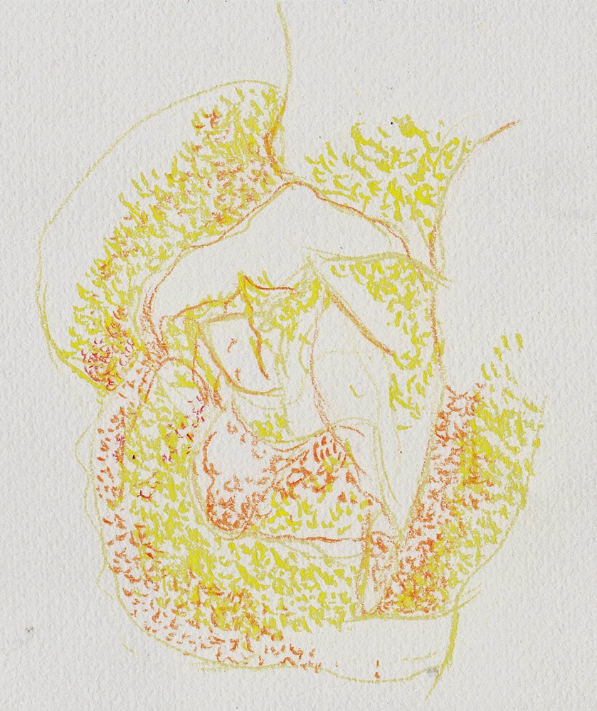
Drawspace lesson Y12: Drawing a Rose Pointillism style!

Pointillism is a painting style developed in late 19th century with George Serat and Paul Signac being its most famous representatives. The idea was to create an object using tiny dots/points of paint. It was laid on a canvas in such a way that  it would create an illusion of blended color while it really wasn't.

I studied about pointillism but I was never really into it. I do admire the hard work that was invested by the artists practicing the style. I also understand some of the reasons for this style being developed, but I was never truly drawn towards it.

So it would be my first experience with Pointillism here.

And while drawing I got lost pretty quickly. So I stopped right there. No pointillism for me. At least not at this point.

P.S. Looking at it one can hardly say it's a Rose... or any other flower....

May 11, 2014

Drawspace lesson Y10: Drawing colorful symmetrical wings.

Don't get me wrong, I didn't jump from one lesson to another this time. It's just for some reason some lesson in this section were skipped.

There are not to many explanation or techniques in this one so I'll just show you my drawing.
I used a new paper this time (keep on experimenting with materials), 160gr 100% recycled eggshell-color grained paper; erasable Staedler colored pencils and Bruynzeel Design 12 colored pencils.

If you look closely you will see that the left and the right wings were done a little bit differently.

I did the left wing according to the lesson: color first, black outline second. I felt that It didn't work very well for me I decided to first make the outline and then fill it with color. You can see that the right wing is way cleaner then the left one.

So here it is. See you next lesson.

May 09, 2014

Drawspace lesson Y02: Drawing a blue puppy.

Lesson Y02 suggests a drawing of a blue puppy. The drawing itself was easy and cute, but my biggest struggle here was to keep the fur look like a fur. I felt that as much as I tried to keep my pencils sharped and my strokes short it just didn't work well. It seemed that the paper (180gr, grained) and the pencils (Bruynzeel, 12) I was using were too soft for this kind of sketch.
And I do love how the eyes came out.

So I gave it another try. Same pencils, lighter (probably 120gr) and smoother paper.
Very quickly I realized that I won't be getting the desired effect so I hardly bothered to finish my sketch.

So my conclusion is that my Bruynzeel pencils are way too soft for this kind of drawing. They are great, but not for drawing fur.

May 08, 2014

Drawspace lesson Y03: Value in colors.

This is one of the most important lessons on working with color given on this program. It talks about different values of color and how to use and mix them.
The subject of color wheel and color matching was always my weak side, so at times I tried to read as much as possible on the subject. But I guess that experience is everything here. That's why I so much loved a phrase on page 2 of the lesson: "...In the beginning it's mostly guesswork."

Just for the fun of it I decided to do several strips of pencil values - graphite and colored, 6 of each, all done with the single pencil.

It was fun. Relaxing. You should do it too.

May 04, 2014

Drawspace lesson Y01: How to draw a Rose on black paper

I decided to skip from section S to section Y. The reason is that sections T and U are about human drawing and shading. Not my thing at the moment.

Section Y, on the other hand, is all about Color drawing so it's going to be fun. 

The subject is a yellow rose on a black paper. It's my first time with dark paper so it's going to be interesting.

This is the sketch I did with my simple, hard colored pencils. The nice thing about them is that you can actually erase it's trace, if necessary. 

This is the drawing with my oil-based pencils.

As it usually happens, I'm happy with the experience, but not with the result.

So here's another try, also on black. (see reference)
After creating a first rough sketch I decided to outline it with white so I could better see the rose on black paper. What a mistake! Should've done it with pink instead. Oh well, next time.
While drawing I began wondering if roses of the same kind have the same number of petals? This is the answer I found online.

Since I wasn't pleased with the result once again I decided to challenge myself a bit more and draw this White Calla
This one went really nicely. My only problem here was that I killed my paper pretty fast and didn't reach the richness of the white. 

Any advice here?

P.S. At least now I know what the white pencil is for ;)

May 01, 2014

Developing creativity: creating an image from a scribble.

It's time for another creativity development exercise. I will be using one from IllustrationClass again and it's called Drawing the line. The idea is to create a scribble and to work from there.

For the first tryout I printed some samples given online.

Some of them were easy to do; some of them I had to rotate to create something of it.

Some of them just didn't work for me.

This is another session. I scribbled my own lines and then added more details.


The one thing I regret is that I made my lines with a black and not colored pen. This way you could see the lines and the editions.