February 26, 2010

IF: Propagate

Actually, this is my first submition to IF.... Lets hope - not the last one....


Why mushrooms? Because they propagate!

February 25, 2010

Illustration Friday - New topic every week.

My first year of college was all about exersizes. Every week there was a different subject, every week another short porject, a week-to-week brainstorming... on every diciplne we had - photography, drawing, painting, sculpturing.
I remember that during our second year everybody talked about how much they missed these little week to week excerses.

So Illustration Friday is, as they say of themselves, "...a weekly creative outlet/participatory art exhibit for illustrators and artists of all skill levels. It was designed to challenge participants creatively.... "

I've known about this program for like a year or even more. But like i said - lack of self dicilpine. I hope it will change from now on.

February 23, 2010

Drawing an open book


In this tutorial I will show you how to draw an open book. Every new step will be represented by a punctured line.

1. Draw a basic trapeze and divide it in the middle.

2.Create another, smaller trapeze inside the first one.
3.Draw short diagonals in the corners of the smaller trapeze and connect them as shown.

4. Connect the corners to the center of the book with curvy lines as shown.
5. Draw a small triangle at the base of the central line - make sure its base is curvy.


6. Erase the unnecessary lines.
7. In the "pages part" draw some curvy lines so the book looks like it has some actual pages.


Thats all. Hope you enjoyed this tutorial.
If you have any question regarding this tut, dodn't hesitate to ask.

Making of an open book with Illustrator


Following the Making of a closed book tutorial in this one I will show you how to make an open book.


1. Open a new document and File - Place a reference image. Change Opacity to 25. Enlarge, if needed. Lock layer and create a new one.

2. On a new layer draw a cover of the book using a Pen tool - see red lines. Move anchor points to make the figure match the reference. Hold Alt to move each handle separately.

3. Create a New Layer. Outline the pages parts as shown – left and right parts separately - see blue lines. Add short lines for corners. Choose all (CTRL + A). Go to a Pathfinder menu, choose Divide. Right – click to Ungroup.

4. On a new layer outline the open pages part as shown. Draw a line in the middle, Go to a Pathfinder menu, choose Divide. Right – click to Ungroup.

5. Unlock layers, hide the reference and choose all. Apply white Fill color and black stroke to all elements.

6. Add some lines on the pages part to give an effect of actual pages.


Now let’s add some color.
7. Duplicate open pages and paste on a new layer. Arrange so that the bottom outline will be visible.

To color these pages we will use a Mesh tool.


8. Choose Mesh tool and click in the middle of the page. It will create a new anchor across the page. Add more lines – as shown.

9. When applying color remember, that the brightest color should be on the highest part of the page and the darkest – on the lowest.

10. First give it all a bright grey color. I used grey from Swatches pallet – k5, k10, k20. To apply colors choose three Mesh points on one page. Those inside the page will be the darkest those outside the page will be the brightest. Lock layer.


11. Choose the inside pages and apply a grey gradient.

12. Go to Cover layer and duplicate and paste the image. Bring to Back.

13. Apply any gradient to your book cover.

This is it. The book is ready.

If you have any question regading this tutorial, dont hesitate to post it here.

5..., 10..., 15... minutes drawing

A very known exerscise for training one's drawing skills is a 5, 10, 15 minutes per sketch exersise.

What you do is you choose a topic/object/scene and do a quick 5 minute sketch of it. Then you do the same - but for 10 and 15 minutes.
The idea is to learn how to create quick drawing. It is very useful when you whant to capture an object or a scene but don't have the time to create a fuul detailed drawing.

For the sake of this post I took a fresh tomato and this is the result.

It seemst that my 10 minutes is better than my 15 minutes sketch... Oh, well...

The one thing i've discovered is that 5-15 minutes are actually a lot of time for something like tomato...
So I guess i'll be posting this 5-15 minutes sketches... to see my progress...

February 19, 2010

Drawing a closed book


In this tutorial I will show you how to sketch this closed book. There is another tutorial explaining How to create a closed book with Illustrator .


So to draw a closed book you have first to draw a rectangle.

Then convert it to a 3 demential box.

Add two arcs on the left side of the box for a books’ binding and erase the unnecessary lines.
Add another line on the right side of the book – it will give it more depth.

We've created a binder of the book.

Now what’s left is to draw its pages.

Draw two lines parallel to the binder but a bit shorter.
Connect them with two arches.

Your closed book is ready.

If you have any question regarding this tutorial don't hesitate to post it here.

February 17, 2010

Making of a Closed book with Illustrator


In this tutorial I will show you how you can create an illustration of a closed book.


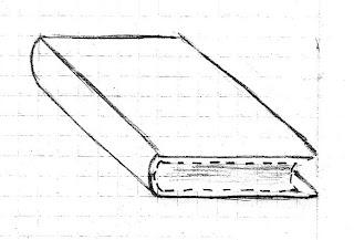
1. Open a New document and File + Place a reference image. You can create your own or use this one.


2. First we will draw the upper cover of the book using a Pen tool. Move anchor points so they fit the reference image – hold Alt to move each handle separately. Of course, you can do the same using a rectangle tool, but since it won’t be as flexible as a hand drawn figure we won’t use it this time. Delete the Fill color and change the Stroke color to something other than black. Also I made the stroke 2 pt (we will change it later).

3. Duplicate the rectangle and right click your mouse to Arrange and Send to back. Place as shown. Choose both objects and Align to Left. Make it fit the reference image

4. Use Pen tool to create the binding and the pages of the book.


5. To make the book cover look thicker, duplicate the pages outline and copy paste it on a new layer. Lock other layers.

6. Change the Stroke color of this new outline so you can see other lines – I changed it to Green.

7. Drag it to the right to make it longer.


8. Duplicate this figure and make it fit the book cover perfectly. Bring it to back (Shift + Ctrl + [). Choose both, go to the Pathfinder menu and choose Divide. Right - click to Ungroup them. Delete all the unnecessary parts.

9. Paste this element back to the main layer.


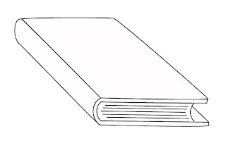
10. Hide the layer with the reference image. Choose all (Ctrl + A). Give it all a White color and a Black stroke.

11. If some of the elements are not in the right place - like the back cover is on front, or the pages are invisible, right click your mouse and arrange it the way it should be.

12. Make adjustments, if needed.

13. For the last touch, create some lines on the Pages figure to make it look like there are actually some pages inside.

The outline is ready – let’s put some color on it.

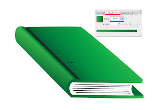
For the color I used green gradient with some mesh colors.


14. Choose a front cover and apply a Mesh tool (U) on it. Apply twice more so you have three parallel lines running through your front cover. Move the anchors, if needed. Don’t worry, if the outline disappears. As long as the lines are visible – we can work with it, we will apply the color later.

15. Choose central anchors and move them down a bit. Play with the anchors’ handles to deform the cover.

16. Now choose the color you want to work with. It will be a dark color, a light and the one in the middle. It is very important that when you are satisfied with you colors you will write down its data so you can work with it later. It might be helpfull to remove the upper cover to another layer and lock the rest.


17. Choose the element and apply the brightest color. I chose two RGB Greens – 0, 104, 56 and 55, 179, 74 and Black. Now for the interesting part. We will create a nice gradient using the meshes we just applied. Choose the central anchors and apply a darker color. For other two – the middle color. You should have a result close to this.


For my taste the cover curve is too small so I will move it a bit to the left. Also I will deform another part of the cover, this time just adding some anchor points without using Mesh.

18. Choose the Binding of the book and apply a Linear Gradient (G) tool to it. Apply the same Gradient to the Back cover and to its front.

19. Choose all and delete the stroke lines. Make adjustments.


20. Apply a Gradient on the “Pages” – bright yellow and bright grey.


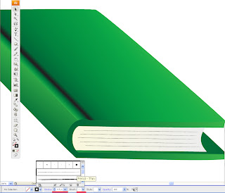
21. Change the pages strokes to 0.5 and its brush style to Pencil Thin.


That is all. The book is ready.
I hope you found this tutorial helpfull.

If you have any question regarding this tutorial, dont hesitate to post it here.

Best regards

February 14, 2010

Basic forms - thats the start

Some time ago I found this cool exercise saying that when you combine two circles, you can create a new form.

It seems that since we have only three basic forms - a circle, a triangle and a square - the possibilities are limited. But when you are done with two forms - you can start combining three, and then four and then five and then.... well, you get the idea...

So these are my latest tryouts with circles:


I started with just circling with my pencil...


And then were these obvious glasses and bicycle, and this cute sunflower...


And then - more flowers and circles...


I think it is a great brainstorming exercise, so I 'm sure I’ll get back to it from time to time, or even use it as a pre-drawing exercise...

February 08, 2010

Creating a Valentine greeting card with Illustrator - Part 2: The Background


In Part 2 we will be creating a Valentine card itself using the Heart image we created in Part 1 .


1. Place the heart you created in Part 1 of this tutorial on a new document and group it (Ctrl +A, right click - Group).


2. Create a new layer and copy paste a heart on it. Lock and hide it for now.


3. Duplicate a visible heart a few times and place and transform it as shown - you don't have to be precise.

4. Choose this group, make it smaller and place in the upper left corner of your document. Duplicate it (Alt + drag) so it fills our working space.


5. Choose all hearts (Ctrl +A) and go to Object – Transform – Transform each.

6. First check Random and Preview so you could see all the changes you're making.
Play with the settings a bit. I suggest you make some manual changes after this step to spread it a little bit more.

7. Add a new layer above this one. Create a rectangle to completely cover the spread hearts. Fill it with bright pink corol(0, 9, 100).


8. Go to Transparency window and choose Screen.


9. Unlock the Heart layer and place it above the others. Duplicate and place as shown – or as you wish.

10. To write a personal greeting press T on your keyboard and start writing. To change size and font go to Type – Size/Font.

That’s it.
Happy Valentine!!!

If you have any question regarding this tutorial - don't hesitate to post it.

February 07, 2010

Making of a Valentine greeting card - Part 1: The Heart

Valentine’s is just a few days away so today we’ll be creating this Valentine Day Greeting card.


This tutorial will be divided in two parts. In Part 1 we will create the Heart itself. In Part 2 we’ll create the background for our card.

Let’s begin.


1. Create a big circle (L+Shift). Press Shift + C on your keyboard and choose circle’s bottom anchor point. It will turn from round to pointy.
2. Press A and choose the upper and bottom anchor points and pull them down a bit till it looks like a huge water drop.


3. On a new layer create another, smaller circle and duplicate it (Alt+ drag). Go to Window + Align and choose Vertical Align Bottom. Place as shown.


4. If needed, pull the upper point down a bit more to create a shape of a heart.


5. Choose all figures and go to Window - Pathfinder. Press Add and Expand.

6. Duplicate (Alt+drag) the heart twice and place as shown.


7. Choose both hearts, go to Pathfinder and choose Divide and Ungroup.

8. Choose the right part of the divided heart and place as shown. Alight to Top and Right. Erase the leftovers.


9. Create another copy of the original heart and move it aside. Press R and choose Hearts bottom anchor. You will see a small blue circle appearing above it. Press Alt and rotate to right as shown.


10. Choose both hearts, go to Pathfinder window again and press Divide and Ungroup (rightclick).


11. Choose the left part and place as shown.


12. Place it as shown. Make this detail a little smaller by moving corners. This will be the a white highlight
13. Another way to create this highlight is to draw a crescent shape with a Pen tool.

It’s time to color the heart.


14. Choose Cherry color for the right part and White for the Left. Delete Stroke for both.
15. The heart itself will be colored with Radial gradient colors - Red and Yellow. Apply by pressing from upper the left corner of the heart.

The heart is ready.

In Part 2 of this tutorial we'll be making a background for our Valentine greeting card.

If you have any question regarding this tutorial - don't hesitate to post it.