May 27, 2013

Drawspace: Lesson CO7 - how to draw a Manga character (Kira)

Hi hi, how are you?

This is a C07 Lesson of a Drawspace art program and it's a Manga character again.

This character has some longer features and its face doesn't fit in a perfect square. Although, it's still very schematic and "point A to point B" like.
But let's begin.

This is the pre-erasing draft; you can see that all the helping lines are still there.


And this is the final image.


Frankly, my Kira looks more like a serious boy than a gentle girl, and that is because I made her chin a bit longer and narrower than in the original drawing. Bit still, I think that the outcome is ok. 

I keep on learning.  
This is the challenge I chose for myself:


Tip of the day: When drawing long lines like in these images, keep your elbow in the air. It will create the movement freedom to your arm to make a long smooth line.

I hope you enjoyed this lesson.

Have a great day, 
Dalia

May 23, 2013

Drawspace: Lesson CO6 - how to draw a Manga character (Bitty)

Hello,

and welcome to Lesson C06 of the Drawspace art program.

This lesson suggests us to draw a Manga character.
I find the Manga style fascinating but I'm not a big fan of its cartoons. I find it difficult to deal with its lack of motion. In Manga - it's all about the faces.
But if I separate the drawing from the cartoons - it's absolutely gorgeous. So here's a chance for me to do my very first Manga character!

As I was reading the lesson I felt like I was going back to a High school Geometry class: Draw a square with a ruler. Draw a line from point A to point B. Draw a Line from point C to point D.
Can it be that Manga is so schematic? I kept on reading... and yes! It is that schematic.

I did the first scheme.


And then I added some details:


And only after that I erased the helping lines and highlighted the sketch itself.


The funny thing is that my first sketch was so lightly done that it took me sometime to edit it in Photoshop. And since I obviously did one step atop the other, this was my only option.

There was no additional challenge in this lesson so I just browsed the web and found this image to copy from. I used the same method, of course - a square, several supporting lines etc.


I used the lesson as a reference without actually trying to remember the steps in the first place.
There is an obvious problem with the eyes. And I did no shading.

This lesson wasn't difficult, but it was interesting. This is the first time that I did some Manga style drawing and, I believe, it's not going to be the last one.

See you soon,
Dalia

May 19, 2013

Drawspace: Lesson C05 - How to draw a cartoon lion

Hi all!!

Welcome to Lesson C05 of a Drawspace art program. 
This lesson is about drawing Linus the Lion. It is also about drawing the image using a symmetry line. 
While sketching I created more helping lines that Ms. Hoddinott suggested, I added the eye and the ear level lines and the muzzle level line.

This is the result, it was really an easy one.


When I got to the end of the lesson I've realized that there was no challenge in this one. But while sketching Linus, I constantly thought of Alex the Lion from Madagascar movies. So I decided to create my own challenge. 
To draw Alex I first Cropped the image and made it B&W with Photoshop to escape the destruction of the color.


Since this image is not as symmetrical as Linus the Lion, I decided to use my new Drawspace skills to make it as accurate as I can.

So here it is, the final result.


And boy, it was a challenge!!!
But it was a nice experience. I even dated it so I could draw it a few months' time to see the difference between now and then.

I hope you enjoyed this post.

Have a great day,
Dalia

May 14, 2013

Happy Shavuot

Hello all!!!

It's holiday season again and this time is Shavuot.
It's all about Comendments, eating cheese and shooting from water guns.


Happy happy again!

Have a great Shavuot everyone,
Dalia

May 10, 2013

Drawspace: Lesson CO3 - How to draw a Koala.

Hi all,

Welcome to Lesson C03 of a Drawspace art program. This lesson we're drawing a Koala.
I read and I start.

The process itself was easy - a several circles and some furry stroking.


There was no challenge so I to make one I searched the web a bit and found the image of this cute Koala from the San Diego Zoo blog.


And while drawing Koalas I felt a strong need to draw a Cheburashka, one of the cutiest charachters of my (and many others) childhood. This is my reference and this is the sketch.


I had a great time doing these sketches. For some reason it felt too easy to do. Well, maybe, because it was easy. Or maybe I'm getting better at this thing called drawing.
I wish to hope it is the second option.

I wish you a great day,
Dalia

May 06, 2013

Tutorial writing - the process and the outcome.

Hi hi,

Some time ago I created and published a tutorial about How to make Pessah Matza bread with Illustrator.
It's been a while since my last serious tutorial and this time I wanted to share the process of making a tutorial itself. I am a great tutorial consumer myself and I began writing these when I could not find the answer to some of my questions. Also, I know very well how frustrating it is when you follow somebody else's tutorial and in some point you just loose it. Because if there's a gap - even the tiniest - you can't follow it anymore. Because there are details missing.

So usually, when I write my tutorials I try to make it as detailed as possible, whit lots pictures and Shortkeys. Editing it several times before publishing or submitting.

And after writing this Matza tut, I felt strong need to share the process with you guys.
So here it goes.

My first draft looked like this:


I made notes while doing the actual artwork, something really quick to help me remember the process.

After that I typed the text on my PC and made a printout. With a red pen in one hand and a mouse in another, I followed the text to make sure it is clear to the user. While at it I added some more details to the text.
.


I repeated the process 5 more times before publishing my tutorial. At some point I even stopped and gave it a several days break to give it a fresh eye.

This is the very last version of this text. As you can see, even here I kept adding more and more details.
The numbers on the left is the marking of the images placement.


Notice, that all this process does not include any image editing, which is also pretty complicated and time consuming.

This is not the first time I write a tutorial. But somehow this time it felt more difficult than ever.
So to all those tutorial writers - a great respect from me to you and keep up with the great work you're doing.

Have a great day,
Dalia

May 01, 2013

How to make a plane silhouette with Illustrator tutorial

Hello,

Let's do another tutorial. I am going to show you how to create an Airplane silhouette with illustrator. 


We'll be working with basic shapes, some nice transformation tools and Gradient colors. Also we will slightly touch the subject of perspective drawing.

But before we begin - let me tell you something. I'm a female. Never in my life have I drawn an airplane. Ever. I did try to do it several months ago, but it was a complete fiasco. Today, after releasing the Independence day card, I feel a need to share the knowledge.

I wanted to create a simple plain without any details, a silhouette level plane. First I did some basic pencil sketch - it always helps me to understand the structure of the form better - and then started working. 

So....

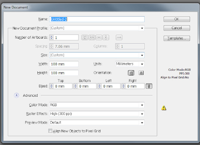
1. Open a New document (Cltr + N) 100mm*100mm in Illustrator.


2. Choose an Ellipse tool |(L) and create a narrow ellipse (click the artboard and Drag the mouse down).


3. Choose a rectangle tool (M) and draw a narrow rectangle in the head part of the ellipse. This will make the base of the airplane wing.


4. Now let's shape the wing itself. Choose the upper right point of the rectangle (A + choose) and use the keyboard's Down arrow to place it a bit lower. Choose the bottom right point and raise it up a bit.

5. Create two smaller ellipses (L; click + drag down); these will be the bombers. Choose them and bring backward (Choose + Cltr + Shift + [ ).

6. Group the wing and the bombers (Choose + right click + Group).


7. Right click the wing group and go to Transform + Reflect. Choose Vertical and Copy. Place the second wing on the opposite side of the plane, and Ungroup all (right click + Ungroup).


8. Copy and drag two wings to the tail section (choose + Alt + Drag). Make them smaller (Choose + Shift + Scale).

9. Create another smaller rectangle (M; click + drag) in the bottom section. Move some points to shape a tail (A; use keyboard arrows). Place it somewhere in the bottom right part of the plane (as shown).


10. Choose the body of the plane and apply a Gradient color to it. Go to gradient panel, double click one of it's handles and pick a color from the Swatches menu. I chose light blue for one and a bit darker shade for the other. Press G and apply a gradient vertically, up to bottom, dark to light.


11. Choose all (A) and delete Stroke color(/).


12. Adjust the gradients so the plane looks like a smooth structure. Move all the right wings to the back (Cltr + Shift + [ ).

13. Choose the whole plane and rotate it left a bit.


This is it. The plane is ready.

Tip of the post: Always make a sketch with your pencil on paper before you start working with illustrator - it will help yo to understand the structure of the object better.

Have a great day, 
Dalia